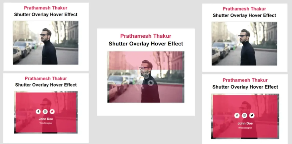
Adding dynamic effects to your website can enhance user engagement and give it a modern touch. One such effect is the Shutter Overlay Hover Effect, which adds a sleek, animated overlay on images or cards.
This article provides free code that you can use to create this effect on your website. You can integrate this into cards, about sections, and other creative areas. Follow along as we explain how to use this effect step by step!
What is a Shutter Overlay Hover Effect?
The Shutter Overlay Hover Effect is a stylish animation where overlay panels slide in when you hover over an image or card. This creates a professional and interactive user experience.
Benefits of Using this Effect
- Versatility: Can be used in image cards, profiles, or call-to-action sections.
- User Engagement: Makes your website visually appealing and interactive.
- Ease of Use: Simple to implement with HTML and CSS.
Free Code for Shutter Overlay Hover Effect
Here’s the free code for creating a Shutter Overlay Hover Effect. You can copy and paste it directly into your project.
HTML Code
<!DOCTYPE html>
<html lang="en">

<head>
    <meta charset="UTF-8">
    <meta name="viewport" content="width=device-width, initial-scale=1.0">
    <title>Shutter Overlay Hover Effect</title>
    <link rel="stylesheet" href="https://cdnjs.cloudflare.com/ajax/libs/font-awesome/6.3.0/css/all.min.css"
        crossorigin="anonymous" referrerpolicy="no-referrer">
    <link rel="stylesheet" href="styles.css">
</head>

<body>
    <h1>
        <span>
            Stunning Shutter Overlay Hover Effect <br>
        </span>
    </h1>

    <div class="box">
        <img src="man.jpg" alt="Person Image">
        <div class="box-content">
            <div class="content">
                <ul class="social">
                    <li><a href=""><i class="fa-brands fa-facebook-f"></i></a></li>
                    <li><a href=""><i class="fa-brands fa-instagram"></i></a></li>
                    <li><a href=""><i class="fa-brands fa-twitter"></i></a></li>
                </ul>
                <h3 class="title">John Doe</h3>
                <span class="post">Web Designer</span>
            </div>
        </div>
    </div>
</body>

</html>
CSS Code
body {
    font-family: Arial, Helvetica, sans-serif;
    background-color: #f4f4f4;
    text-align: center;
}

h1 {
    line-height: 45px;
}

h1 span {
    color: #E01E48;
}

.box {
    width: 450px;
    background: #fff;
    box-shadow: 0 0 5px #bababa;
    overflow: hidden;
    position: relative;
    margin: 10px auto;
}

.box img {
    width: 100%;
    height: auto;
}

.box .box-content {
    width: 100%;
    height: 100%;
    position: absolute;
    top: 0;
    left: 0;
}

.box .box-content:before,
.box .box-content:after {
    content: "";
    width: 95%;
    height: 47%;
    background: #E01E48;
    position: absolute;
    left: 0;
    right: 0;
    margin: auto;
    transition: all 0.5s;
    opacity: 0;
}

.box .box-content:before {
    top: -20%;
}

.box .box-content:after {
    bottom: -20%;
}

.box:hover .box-content:before {
    top: 3%;
    opacity: 0.8;
}

.box:hover .box-content:after {
    bottom: 3%;
    opacity: 0.8;
}

.box .content {
    position: absolute;
    top: 0;
    left: 0;
    bottom: 0;
    right: 0;
    margin: auto;
    text-align: center;
    transform: rotate(90deg);
    opacity: 0;
    transition: all 0.5s;
}

.box:hover .content {
    opacity: 1;
    transform: rotate(0deg);
}

.box .social {
    padding: 0;
    margin: 0 0 20px 0;
    list-style: none;
}

.box .social li {
    display: inline-block;
    margin-right: 10px;
}

.box .social li a {
    color: #000;
    background: #fff;
    display: block;
    width: 35px;
    height: 35px;
    line-height: 35px;
    border-radius: 50%;
    font-size: 18px;
    transition: all 0.5s;
}

.box .social li a:hover {
    color: #E01E48;
}

.box .title {
    color: #fff;
    font-size: 22px;
    margin-bottom: 7px;
}

.box .post {
    color: #fff;
    font-size: 14px;
}
Download the Image (man.jpg)
To make your implementation even easier, I’m providing the man.jpg image used in this tutorial. You can download it directly from my blog and use it in your project. This image is already optimized and ready to work with the Shutter Overlay Hover Effect code provided above.
How to Use This Code in WordPress
- Upload the Image: Add the
man.jpgimage to your WordPress media library or theme folder. - Add HTML Code: Paste the HTML code in your WordPress post, page, or widget where you want the effect to appear.
- Insert CSS Code: Navigate to Appearance > Customize > Additional CSS and paste the CSS code.
- Preview and Publish: Save your changes and preview the effect live on your website.
Code Explanation
| Code Segment | Explanation |
|---|---|
.box | Defines the container with a shadow effect and fixed dimensions. |
.box-content:before, :after | Creates the animated sliding overlays for the hover effect. |
.box:hover .content | Ensures the text rotates and becomes visible on hover. |
.social li a | Styles the social media icons with hover animations. |
FAQs
Q1: Can I use this effect for multiple images on the same page?
Yes, duplicate the HTML structure for each image and reuse the CSS.
Q2: What browsers support this effect?
The effect works on all modern browsers like Chrome, Edge, and Firefox.
Q3: How do I replace the image?
Simply update the src attribute in the <img> tag with the new image path.
Q4: Can I customize the colors?
Yes, you can modify the background properties in CSS to use your preferred colors.
Conclusion
The Shutter Overlay Hover Effect is a simple and elegant way to add interactivity to your website. With the free code provided, you can implement this feature effortlessly. Whether it’s for image cards, profile sections, or call-to-action areas, this effect can enhance your website’s design and user experience.
Try it out today and impress your visitors!


